刚刚用 CSS 画了只兔子,趁热写下这篇文章作为记录。
结构设计
提到作画,手写也是进行结构的拆分,我们可以将兔子拆分为以下几个部分:
- 耳朵
- 头
- 眼睛
- 鼻子
- 嘴巴
因此可以轻松设计出以下的 HTML 结构:
<div id="wrap">
    <div class="ear left"></div>
    <div class="ear right"></div>
    <div class="face">
        <div class="eye left"></div>
        <div class="eye right"></div>
        <div class="nose"></div>
        <div class="mouse"></div>
    </div>
</div>
绘画
基础绘制
结构定了,我们可以进行绘制了,首先我们先绘制画框,因为小白兔是白色的所以需要选用一个别的颜色作为背景色。并且为了方便我们直接把所有的元素设置为 absolute:
#wrap {
    width: 300px;
    height: 400px;
    border: 1px solid #ddd;
    margin: 0 auto;
    position: relative;
    background-color: #b2d8ce;
}

.ear,
.face,
.eye,
.nose,
.mouse {
    position: absolute;
}
耳朵
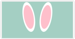
然后是耳朵部分,我们的小兔子有两个耳朵,为了更真实,小白兔的耳朵内部都是粉色的,我们也将耳朵设计成内外耳两部分:
.ear {
    background-color: white;
    height: 130px;
    width: 50px;
    border-radius: 50%;
    display: flex;
    justify-content: center;
    align-items: center;
    left: 100px;
    transform: rotate(-10deg);
    transform-origin: bottom;
}

.ear.right {
    left: unset;
    right: 100px;
    transform: rotate(10deg);
}

.ear::after {
    content: '';
    background-color: #ffccd5;
    width: 80%;
    height: 80%;
    border-radius: inherit;
}
这里我们使用 border-radius,将耳朵绘制成椭圆形,然后通过 transform 将耳朵角度旋转,让其更加真实。对于右耳朵为了方便我们直接使用 unset 重置 left,然后通过 right 去设置。
然后我们通过 after 伪元素来添加内耳部分。宽高直接使用百分比,方便大小变化。
脑袋
然后是脑袋部分,不用细说,直接画个大白圆即可。
.face {
    border-radius: 50%;
    width: 150px;
    height: 150px;
    top: 100px;
    background: #fff;
    left: 75px;
}
眼睛
眼睛为了让其效果更好,添加了反光的小白点。
.eye {
    background-color: black;
    border-radius: 50%;
    width: 20px;
    height: 20px;
    left: 35px;
    top: 40px;
}

.eye.right {
    left: unset;
    right: 35px;
}

.eye::after {
    content: '';
    width: 5px;
    height: 5px;
    position: absolute;
    bottom: 9px;
    right: 9px;
    border-radius: 50%;
    background-color: white;
}
结构类似于耳朵,同样使用伪元素绘制内部反光的小白点。
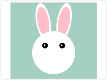
鼻子
鼻子部分也非常简单,直接绘制一个小圆圈调整好位置即可。
.nose {
width: 15px;
height: 15px;
left: 68px;
background-color: rgb(93, 51, 51);
border-radius: 50%;
top: 80px;
z-index: 100;
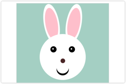
}嘴巴
嘴巴部分要绘制一个弧形,可以使用 border-radius 直接绘制一条弯曲的 border,这里我使用了另一种办法:将两个圆进行偏差形成一个弯月形的嘴巴。
.mouse {
    background-color: black;
    width: 40px;
    height: 40px;
    border-radius: 50%;
    top: 95px;
    left: 55px;
}

.mouse::after {
    content: '';
    background-color: white;
    width: 40px;
    height: 40px;
    border-radius: 50%;
    display: block;
    top: -6px;
    position: absolute;
}
动画
最后,为了让小兔子更有灵性,增加了动画,主要包含眼睛的动画和耳朵的动画:
@keyframes eye-animate {
    0%,
    end {
        bottom: 8px;
        right: 8px;
    }

    33% {
        bottom: 3px;
        right: 5px;
    }

    66% {
        bottom: 3px;
        right: 12px;
    }
}

@keyframes left-ear-animate {
    0%,
    end {
        transform: rotate(-15deg);
    }

    50% {
        transform: rotate(5deg);
    }
}

@keyframes right-ear-animate {
    0%,
    end {
        transform: rotate(15deg);
    }

    50% {
        transform: rotate(-5deg);
    }
}
眼睛的动画直接移动眼睛反光的位置即可,耳朵需要注意使用 transform-origin 将动画的原点设置为底部,这样旋转时效果更好。