最近因为苹果 WWDC 的原因带火了流体玻璃效果(Liquid Glass),有很多不同的实现方式,今天看到比较简单的一种实现,使用 CSS 和 SVG 即可。
效果
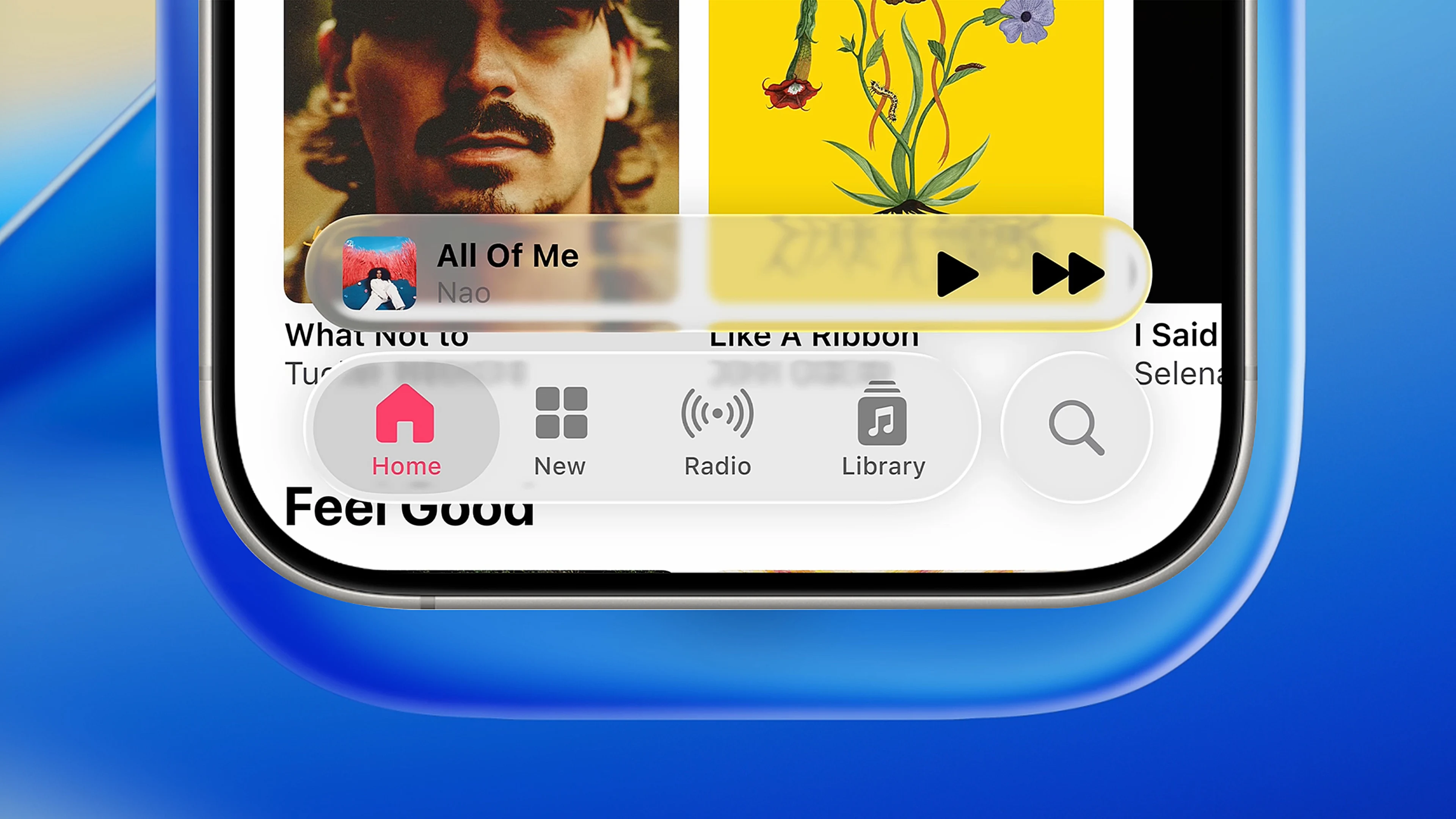
Liquid Glass Effect!
实现
这种方式本质上是使用了 SVG 的滤镜效果,通过 feTurbulence、feSpecularLighting 和 feDisplacementMap
等滤镜来模拟玻璃的折射和光泽效果、流体的波动。
首先需要使用定义一个 SVG 滤镜:
<svg style='display: none'>
    <filter id='glass-distortion' x='0%' y='0%' width='100%' height='100%' filterUnits='objectBoundingBox'>
        <feTurbulence
            type='fractalNoise'
            baseFrequency='0.01 0.01'
            numOctaves='1'
            seed='5'
            result='turbulence'
        ></feTurbulence>
        <feComponentTransfer in='turbulence' result='mapped'>
            <feFuncR type='gamma' amplitude='1' exponent='10' offset='0.5'></feFuncR>
            <feFuncG type='gamma' amplitude='0' exponent='1' offset='0'></feFuncG>
            <feFuncB type='gamma' amplitude='0' exponent='1' offset='0.5'></feFuncB>
        </feComponentTransfer>

        <feGaussianBlur in='turbulence' stdDeviation='3' result='softMap'></feGaussianBlur>

        <feSpecularLighting
            in='softMap'
            surfaceScale='5'
            specularConstant='1'
            specularExponent='100'
            lighting-color='white'
            result='specLight'
        >
            <fePointLight x='-200' y='-200' z='300'></fePointLight>
        </feSpecularLighting>

        <feComposite in='specLight' operator='arithmetic' k1='0' k2='1' k3='1' k4='0' result='litImage'></feComposite>

        <feDisplacementMap
            in='SourceGraphic'
            in2='softMap'
            scale='150'
            xChannelSelector='R'
            yChannelSelector='G'
        ></feDisplacementMap>
    </filter>
</svg>
其中 feTurbulence 用于生成噪声纹理,feComponentTransfer 用于调整颜色通道,feGaussianBlur
用于模糊处理,feSpecularLighting 用于模拟光泽效果,最后的 feDisplacementMap
用于将噪声纹理应用到源图形上,产生折射效果。
接下来在需要应用流体玻璃效果的元素上使用这个滤镜并配合 backdrop-filter:
.liquidGlass-effect {
    position: absolute;
    z-index: 0;
    inset: 0;

    backdrop-filter: blur(3px);
    filter: url(#glass-distortion);
    overflow: hidden;
    isolation: isolate;
}
然后将该元素放置在需要应用效果的元素中即可。
结语
这种实现方式非常简单,不过需要对 SVG 滤镜有一定了解,适合用于一些简单的流体玻璃效果场景。不过我对这些滤镜了解不深,只会照着扒下来改改。(逃